Sunday, April 11, 2010

Colour Film Shoot


Children All Around Me


Ok, I admit, I'm not a fan of my film camera. But we just did an assignment where we had to use colour film on any theme we wanted. I of course, choose children since there's an abundance of them in my day to day life! And afterwards, I'm going to grudgingly admit that I really liked the way the film came out! Eeeks! Does that mean, I won't be putting away my film camera after all once school is over? Here are a few pics from that day. One of course is of my child, the other two I met at the park with their parents and got permission to take their pictures.


Monday, March 1, 2010

Purim 2010!

Too many pictures to put up separately from the two parties we went to, so here's a slideshow of some of them...

Thursday, February 18, 2010

Born into Brothels

What a truly thought-provoking movie. It was filmed in the Red Light District in Calcutta and it's a documentary showing mainly the lives of the children that grow up there.
It was difficult to watch and it definitely showed a side of life that we have no idea of in Canada. These children are born to prostitutes and know that there is a better life out there for them but yet have no way of escaping their future. The documentary shows these children given cameras and the kind of pictures they take in their daily lives. Inter-dispersed with these photographs is the movie camera showing them and their environment. It is obvious most of the movie pictures are taken from the hip so that the subjects are unaware of it and most of the photographs are from the children and the subjects are aware yet not intimidated by the camera.
The kids have such a deep understanding of how they are living as compared to other parts of the world. They know what their parents (or just mothers) are doing for a living and when interviewed, for the most part they say "I like my mom, because she's my mom...". You never hear them say they love their parents. We see some graphic images of the women yelling at the children and the other women, with much vulgarity right in front of the children. Beatings are common and in one case, a boy lost his mother because she was set on fire by her pimp.
Some of the children were placed in boarding schools and given opportunities, yet at the end of the film we see that only a few stayed within the schools. Most went back to the life they knew. It was not a very uplifting film. Definitely not your fake Hollywood type. But it was worthwhile to watch and give us each something to think about. Not only how well off we are even when we complain that we don't have the latest gear, car, iPod, etc, but also what can we do for others that need our help. If we are able to go to a school like Prairieview then for sure we should have charity to give for others. Every little bit helps. Pick an organization and follow through.

Wednesday, February 17, 2010

Pecker

A film by John Waters. Now this was strange. I had no idea what to expect from it but had heard many of my classmates really didn't like this film, so I was pleasantly surprised that I did.
It's about a young man named Pecker (b/c he 'peck's at his food) who goes around his neighbourhood in Baltimore taking pictures of events (yes, rats having sex) and people (strippers, homeless people, his family) with his little black and white film camera. He 'sees art everywhere'. From a show he has in the diner he works at he gets discovered by the New York art world and is suddenly a sensation there. Of course they see the images as amusing insights to the uncultured. Pecker's family and friends are not so happy with how they are portrayed and it affects his relationships until he figures out a way to rectify them. Which he does.
What I liked about this movie is the sly humour running through it. There were many subliminal messages going on - such as the theme to vaginas - pictures of them, pubic hair talk, crabs bar, and more. Plus what it's saying about the art world and how strange it can be. You just never know what's going to be the hit that month. It also was a satirical look at life in Baltimore from which most of John Waters movies are based.
All said and done, very amusing.

Tuesday, February 16, 2010

Movie Week Extravaganza!

Well, rather than have a proper shoot week before exams, we have a movie week with just a few photo assignments thrown in. We're to watch 3 movies and review them.
My first movie that I saw today was O' Brother Where Art Thou

I really liked this movie. It was done by the Coen brother's who are quite frankly a bit off the wall. It's supposed to be based on Homer's The Odyssey, and although I would like to admit that I could tell from reading that book - I never had, but as it happens, neither had to Coen brothers! What I could gather though just from hearing about the Odyssey, there were characters in the movie with relation to the book. For example, George Clooney's character's name was Ulysses, there was a bible salesman (John Goodman) with a patch on one eye - like a Cyclops, there were 3 singing seductive women - like the sirens, and I'm sure many other references that I wasn't able to catch (maybe I'm wrong, but I think for each of their outdoor fireside scenes they are sitting in Roman ruins).

There were two things for me that really stood out in this film. One of them I wasn't even aware of the first time I saw this film, until we saw the short clip about it in the extra's section of the DVD today. It talked about how this film was put through a digital process to change the colour of the scenes and do other special effects that hadn't been done before in film. Rather than use filters and chemicals in processing, they stressed that the movie was shoot 'clean' and then played with post-production. They made the colours de-saturated to create the atmosphere of olden days during the depression times, and the heat of the summer down South.

The other thing that impressed me was the script. It was so intelligent. Especially George Clooney's character. He had the 'gift for gab' for sure. I really had to pay attention to what he was saying to catch all the subtleties of humour at times.

This movie incorporated many different styles, and techniques from movies past, and then re-created it's own unique work. It's definitely worth seeing more than once.

Saturday, January 2, 2010

Winter Holidays 2009

Happy New Year! Welcome 2010!!!
Here's some pictures of what we were up to during our school vacations. Funny that the children and I both had the same days off from school and are both returning back on Monday. Who knew I would be looking forward to school holidays just as much as they do?! :)


This is a picture of my friend's child taken at a Bar Mitzvah that we went to at the Fort Garry Hotel. It was very nice and my kids had a great time with all the activities and lets not forget the candies that were there. I love going to the Fort Garry, since not only do we get to dress up a bit, but it's almost always a Kosher event for us so we can eat to our hearts content. Yum!


Happy Hanukah! I used a very special Menorah for my candles that my friends' gave me for my wedding. This was the first year that each of us lit our own Menorahs. The kids had a fabulous time! We weren't going to let Akiva light his own but he got so upset about the older two doing theirs that we relented. It made Hanukah that much more meaningful to all of us. As Naftali said "This was the best Hanukah ever!"


This was on the 3rd night of Hanukah when we finally relented and let Akiva light his own Menorah. I love how you can see Yitzy's hand guiding Akiva's to the candles. Symbolic of the guiding hands of parenthood.


And what would Hanukah be without doughnuts? I took this shot at the children's school play. They did a fantastic job. In fact I would say it was the best play so far in their short school lives. Akiva is still singing his songs at the top of his lungs...every morning at 5:30 am! I really hate the song 'dreidle, dreidle, dreidle' by now. We also went to a fun party where the kids got to make their own doughnuts. They were covered in powdered sugar and jam by the end of the night, but so worth it to see their smiles while doing it.


Introducing Daisy! My mom got a new St. Bernard puppy over the holidays. She's adorable. I spent quite a bit of time with her, taking her for walks and playing with her. My kids aren't loving her too much right now because she likes to nip and jump but hopefully once she gets a bit bigger and more trained she'll settle down. Just watching her roll around in the snow and stumble along is worth the hassle of taking her out.


Speaking of rolling around and stumbling in the snow...here's Akiva enjoying one of our days spent outside. Thankfully it wasn't too cold this day and we had just had a good dump of snow so we were building a 'pseudo' fort in the backyard. Akiva is more interested in eating snow than much else. I really hope he doesn't find a 'Daisy patch'. We didn't get outside as much as I would've liked since the temperatures were just waaaaay too freezing, but when we did, we had a good time.


Christmas Eve...I was at a friends' house for her family's annual party. This is her sister-in-law and new baby niece. I really wanted the opportunity to take pictures of the baby since I hadn't met her yet and she's so cute. I specifically had them sit in front of the tree so it would be a reference point when looking at the photograph later on. It was a busy night with a couple parties and a dog to walk. For a Jewish girl, I sure had a lot going on that night!


Boxing Day family dinner. Although not the best shot technically, I still like it because it's so rare to get most of the cousins together at one time for a picture. My kids love hanging out with their cousins and my brother John has the best house to host these kind of get-togethers. It's too bad we didn't have all the cousins in for the holidays. I'm lucky to have so many brothers and a sister since between us, we have produced many children who love to hang out with each other. Nothing like family.


Here's Naftali at Canad-Inns water park in Grand Forks. We have now gone 3 years in a row at this time and I think my kids think of it as Paradise. They talk about it all year round and love being there. What could be better? Get to stay in a hotel, eat junky cereal and treats, go swimming, play in the arcade, and watch tv in bed, all without leaving the building? They are already talking about next year...save me now.


My sweet little Adina in her new pink butterfly towel. One of the presents she received over the holidays. For some reason my kids love getting animal towels. It's getting harder and harder to find ones they didn't get the year before. They do get good use though since my kids love their nightly bath.

So that's a quick re-cap of our vacation time. We also had some play-dates, I did a lot of school assignment shooting, spent some time with family, went to movies, hung out at the Forks, had the kids in a winter camp (which they loved), ate tons, and pretty much just spent quality time together without the stresses of school schedules every day. It was awesome!

Have a great year!


Wednesday, December 2, 2009

Yousuf Karsh

Since I've become so knowledgeable in the darkroom ;) I can easily talk about Karsh's techniques used in this image of Helen Keller.
He has emphasized Helen's hands and face with lighting. Even from across the room at the Art Gallery, they stand out. I think he had to have dodged those areas out from the overall exposure, and even more dodging for the left side of her face to make it glow. And given the halo I see over her left shoulder, I bet he also dodged out her body a bit, but not for as long as he did the hands and face. He probably used some magenta for contrast but maybe also some yellow to decrease the contrast of her shirtt. I think that the wall behind her was probably quite light and he gave it a long exposure to make it so dark.
Compositionally he really used lighting to make this portrait stand out. Especially given that Helen Keller is blind and deaf, giving her hands and eyes such importance in the image really epitomizes who she was and what she was about. I think it's a very strong, dramatic image.I was definitely drawn to it.

Thursday, November 26, 2009

Creative Imaging - Colour Block


This assignment was all about colour. The idea is that each colour comes with it's own emotions and we were to try make a photograph that brings across some of those emotions or characteristics, either by planning or finding the composition. Once done that, we were told to think about how that photo makes us feel and to also canvas our friends to see how they react to our photos.
These are my images;


Blue - characteristics = tranquil, serene, reassuring, quiet, cool, can represent loneliness, depression, and sadness.

Some of the responses I got from friends - soothed, cool/chilly, detatched

I really liked how this light bulb glowed blue (ok I admit, I helped it out some by changing my white balance in camera). I thought it conveyed to me coolness and loneliness.


Orange - Warm, strong, brilliant, powerful, references of fire and late afternoon sun, associated with festivity and celebration, can also reference heat and dryness.

Friends reactions - close to nature, inner peace, curiosity.

I was thinking that using a ceremonial mask would bring across the festivity and celebration aspect. Also it looked very powerful to me. Orange is my favourite colour so it always makes me happy and warm.


Green - colour of nature, symbolizes life, health, freshness, and purity. Refreshing to look at. Also when used as a colour cast in an image it is associated with sickness and decomposition.

Friends' reactions - close to nature, calm, sleepy, peaceful, smell the fir tree

I think although I used the tree as my green to associate it with nature, the fact that it had xmas lights in it changed the meaning for people to have more associations to their emotions of the season.


Purple - Suggests religion and royalty

Friends' reactions - confusion, detached/cool, curious

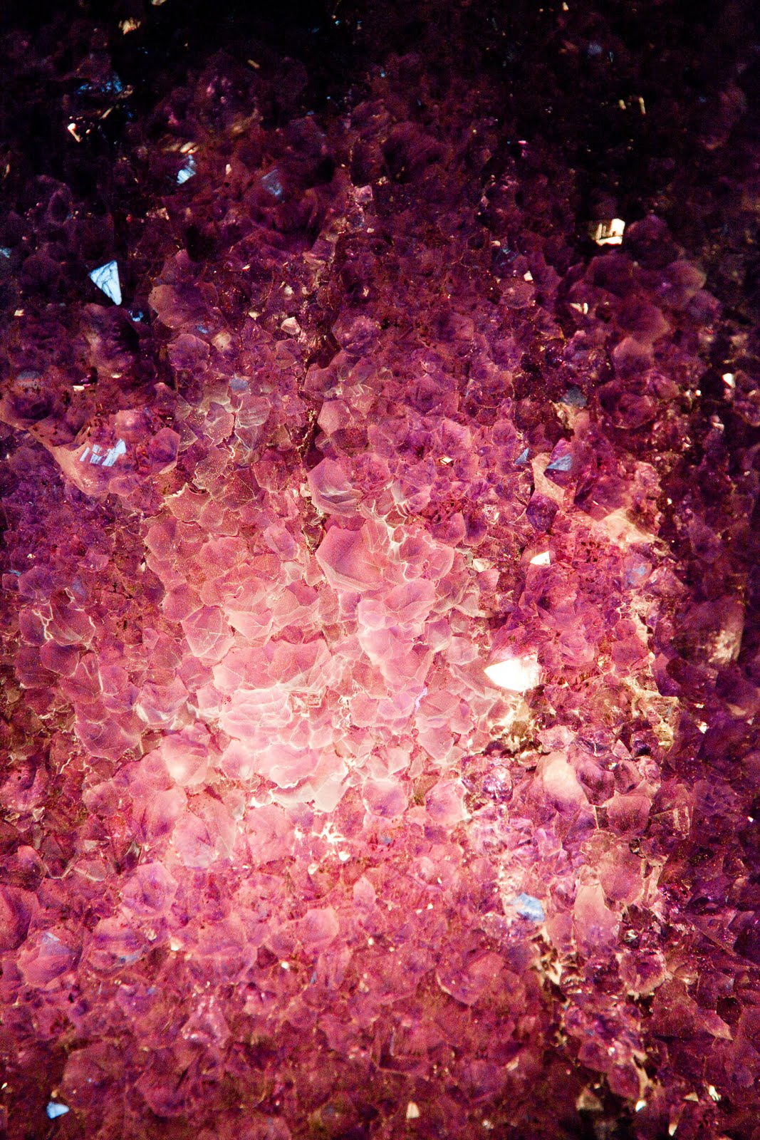
Obviously I totally missed the mark on this image. I was hoping that the gems would inspire a feeling of richness/royalty.


Red and Green (Complimentary Colours - from opposite sides of colour wheel)

Friends' reactions - autumn, hungry, calm

Since we're supposed to feel harmony with these colour combinations, I thought using an example in nature would be the best way to convey that since we see red/green apples so often. It just feels right.


Orange and Red - Similar Colours from the same part of the colour wheel

Friends' reactions - a couple happy's, hungry, and a 'teeth on edge' because of the steel (wouldn't have ever thought that!)

Once again, these kind of colour combinations are considered harmonious therefore should make us feel good. And really, how can you not feel good looking at such bright colours of Jelly Belly's?!

Overall, I think I accomplished what I set out to do - elicit emotion through the use of colour as the central theme of the photograph. It was interesting to hear from others what they thought since with each photograph I was pretty confident that they would feel the same thing I did when taking the shot. Wrong! Once again, it goes to show you how we all bring our own biases to what we see.

Monday, November 23, 2009

Wedding Time!

I went to a really fancy wedding the other night and I was trying out my super duper new camera while I was there. I didn't use a flash at all and so had my ISO set at 6400, hence why all the images are a bit grainy. Which would be fine except the mother of the bride called me last night to ask me if I have any pics since she doesn't like what their photographer has shown her. EEEeeeks!!! I can only explain to her so much that I was just playing around and I'm still learning how to edit my photos. I don't want her to remember a year from now the crappy photos I gave her when I was in my second month of school! So scared. I haven't gotten any feedback from her yet either which makes me nervous.


Here's the link to the Picassa Album:
http://picasaweb.google.ca/kate.rifkind.pv/AlteinWedding?feat=directlink

Monday, November 2, 2009

To the Zoo!

We went on a field trip to the zoo the other day after we finished our exam week. It was interesting in the fact that I haven't been there without children, or on such a crummy day before. Added to that, it was all set up for Boo at the Zoo. I can't believe how intricate all the decorations were. It was really quite cool. I didn't stay long since I have a million other things to do before I had to get home for my Shabbat, but here's some of my better shots.

Peace, Envy and Love...

We were to use symbols or metaphors to express Peace, Envy and Love. Can you guess which is which?


Sunday, November 1, 2009

Contrasts

Hello All,

We had an assignment to choose to photograph some contrasts. Here are some of mine...

Hard/Soft


Liquid/Solid


Long/Short


Light/Heavy


Little/Big


Rough/Smooth


Strong/Weak

Wednesday, October 21, 2009

Oh what a week!

We're currently in what's called a "shoot week", meaning that we don't go to classes and instead have a TON of assignments to shoot. I never thought I'd say...I'd rather be in school. This is an incredibly hard week. Especially since a couple of my assignments involve the need for sun and there hasn't been any for the past 4 days!!! I'm sitting here biting my nails hoping that by tomorrow there will be. Time is ticking. And after this week is our exam week. Just nutty.

Anyhoo, one of my assignments is to write about a photographer that I admire and enjoy their work. I chose Ansel Adams. He rocks! But rather than just saying that, I'm supposed to look more closely at his work and talk about his style, format, camera, etc for the teacher on this blog site. So, here goes....

Ansel Adams (1902-1984)

I've learned a lot about Ansel Adams in the last month or so. And now that I've worked a bit in the darkroom, I understand more about his process for the best image. He, along with other California Bay Area photographers formed a group called f/64. These photographers concentrated on what they termed 'straight' photography rather than the soft focus style that was popular at the time. f/64 because it is the smallest aperture you get on most view cameras which gives the most detail and sharpest focus of the subject.

Ansel Adams used a view camera for most of his work. This is a large-format camera that allows the photographer to control every step of taking a photograph. The downside of it, is it's heavy, the film must be loaded in total darkness and taken out in total darkness. That's why when using a view camera the photographer uses a large dark cloth to cover their head and the back of the camera, and they can see the the subject upside down, glowing brightly, making it easier to focus precisely.
View cameras also use sheet film rather than roll film. The sheet becomes the negative after it is developed. Why this makes a difference in the sharpness of the prints is that the sheet negative is much larger (ex. 5x7 to 35 mm roll film) so there is less distance needed to go from the negative in the enlarger to the photographic paper to create the image (he used an enlarger like the one we saw at Lab Works on the railway track). Allowing the image to be sharper, clearer, have minute detail, and lack of grain. In addition, sheet film can be processed in the darkroom one sheet at a time, unlike roll film that is processed all at once.

The Zone System

Allows photographers to consistently control the tonal range in the negative. From the blackest black to the whitest whites. Formulated by Ansel Adams and Fred Archer in 1939, it is a set of techniques that controls the characteristics of black and white film. It works best with sheet film that can be exposed and developed one piece at a time.


Using the Zone System

1 - previsualize the subject scene in different shades of black and white using the zone chart
2 - take a light meter reading of target zones using a hand-held light meter
3 - adjust exposure to effectively record light on film
4 - determine if the contrast will need to be adjusted by varying the development time of the film.
5 - analyze print to see if it corresponds to what you previsualized.

A Few Samples of Ansel Adams work

Tree with Snow on Branches, Yosemite, California


The subject here is centered but has leading lines drawing our eyes down the path to the back of the photograph to the mountain. The inclusion of all the trees behind the first tree definitely give a sense of space. It is sidelit to create the shadowing that gives us dimensions to the snow on the trees. But also the brightness on the snow gives a sense of being cold. You can see that the whole tonal range is used from the whitest whites to the darkest blacks, yet everything is in detail including the trees on the back mountain. I would imagine he helped the tonal range by dodging and burning in the darkroom and of course by exposure times.


Church, Taos Pueblo National Historic Landmark, New Mexico


I like this photograph for a few reasons. One, because it's different from what I think of as Ansel Adams work (although now that I've researched him I see that he did many types of images, not just large, magestic landscapes).
He has framed the subject a bit off-centered, using the crosses to draw our eyes back and forth from the buildings and the tops of them draw our eyes upwards. The structures are front lit, which brings out the texture in the stone walls. The depth is created by one structure being in front of the other.
I also like the photo because of it's simplicity. The lighting and the sand make me feel hot (I like being hot - no comments pls).
And finally I like this photo because I've been down to that area, so seeing a photograph of it brings back all the other amazing images that I saw there.


Moonrise, Hernandez, New Mexico


This is definitely one of Ansel Adam's most famous prints. It says alot about his mastery of his camera and the darkroom. He took this picture spontaneously while driving with his son and friend. He saw the shot, pulled over and quickly set up his equipment. But he couldn't find his light meter so he had to go on his experience to meter the moon and the buildings, etc.
Once again, we see details in all image and there is huge depth of field. And the whole tonal range is covered. I've never seen mention of it, but I think that the moon actually has a face on it.
What is really cool is that there are many different versions of this print. When Ansel Adams first printed it it was a lot grayer and the sky wasn't nearly that black. He changed all that with darkroom techniques.

Here's something I found on www. photo.net that sums it up nicely-
"Moonrise was Ansel's most difficult negative of all to print. Though he kept careful records of darkroom information on Moonrise, each time he set up the negative, he would again establish the procedure for this particular batch of prints because papers and chemicals were always variables not constants. After determining the general exposure for the print, he gave local exposure to specific areas. Using simple pieces of cardboard, Ansel would painstakingly burn in (darken with additional light from the enlarger) the sky, which was really quite pale with streaks of cloud throughout. He was careful to hold back a bit on the moon. The mid-ground was dodged (light withheld), though the crosses have been subtly burned in. This process took Ansel more than two minutes per print of intricate burning and dodging. Ansel created Moonrise with a night sky, a luminous moon and an extraordinary cloud bank that seems to reflect the moon's brilliance. Moonrise is sleight of hand. Moonrise is magic."

All in all, I'm glad I chose Ansel Adams as my Photographic Hero. His ability and techniques live on and on. There is a lot to learn from him and I amassed quite a bit of knowledge that I didn't have before and was definitely able to appreciate him more now that I'm in school myself.

Ta for now,

Kate

Wednesday, October 14, 2009

Some Shots from the past couple days...

wow, I've been busy! seems like I take about 100 shots a day. Sometimes more! It's nuts. But hopefully with all that, I'm learning something! It's hard to find the time to do everything mind you. Being a mom of 3 little ones, and keeping my house in order, on top of school is definitely a challenge!
Anyhoo, here's some of my latest. Enjoy.


Tuesday, October 6, 2009

Home is where the heart is - and the Photo Ops!

This past week for our Creative Imaging project we had to take all our pictures from inside our home. We were given a list of compositional elements to look for and away we went. The task was difficult because we are so accustomed to our living spaces that we don't see what's there anymore. As the assignment said "We see our home and the objects within it every single day, and yet, too often we do not see the potential of it."
I enjoyed doing this assignment for a couple reasons - 1) I really did have to take a closer look at my surroundings and try to find these elements within it. And 2) I had to use my tripod for all the shots indoors and I haven't really used it before so it was a chance for me to become familiar with it.
Also, I was pleasantly surprised by some of my shots. Some were really cool! But alas, I'm only going to post the top images from each element.

Implied Line


Shape or Form


Pattern or Rhythm


Texture


Symmetrical Balance


Depth


If you wish to see all of my images you can look at my picassa album

CI - Composition At Home