These are my images;

Blue - characteristics = tranquil, serene, reassuring, quiet, cool, can represent loneliness, depression, and sadness.
Some of the responses I got from friends - soothed, cool/chilly, detatched
I really liked how this light bulb glowed blue (ok I admit, I helped it out some by changing my white balance in camera). I thought it conveyed to me coolness and loneliness.

Orange - Warm, strong, brilliant, powerful, references of fire and late afternoon sun, associated with festivity and celebration, can also reference heat and dryness.
Friends reactions - close to nature, inner peace, curiosity.
I was thinking that using a ceremonial mask would bring across the festivity and celebration aspect. Also it looked very powerful to me. Orange is my favourite colour so it always makes me happy and warm.

Green - colour of nature, symbolizes life, health, freshness, and purity. Refreshing to look at. Also when used as a colour cast in an image it is associated with sickness and decomposition.
Friends' reactions - close to nature, calm, sleepy, peaceful, smell the fir tree
I think although I used the tree as my green to associate it with nature, the fact that it had xmas lights in it changed the meaning for people to have more associations to their emotions of the season.
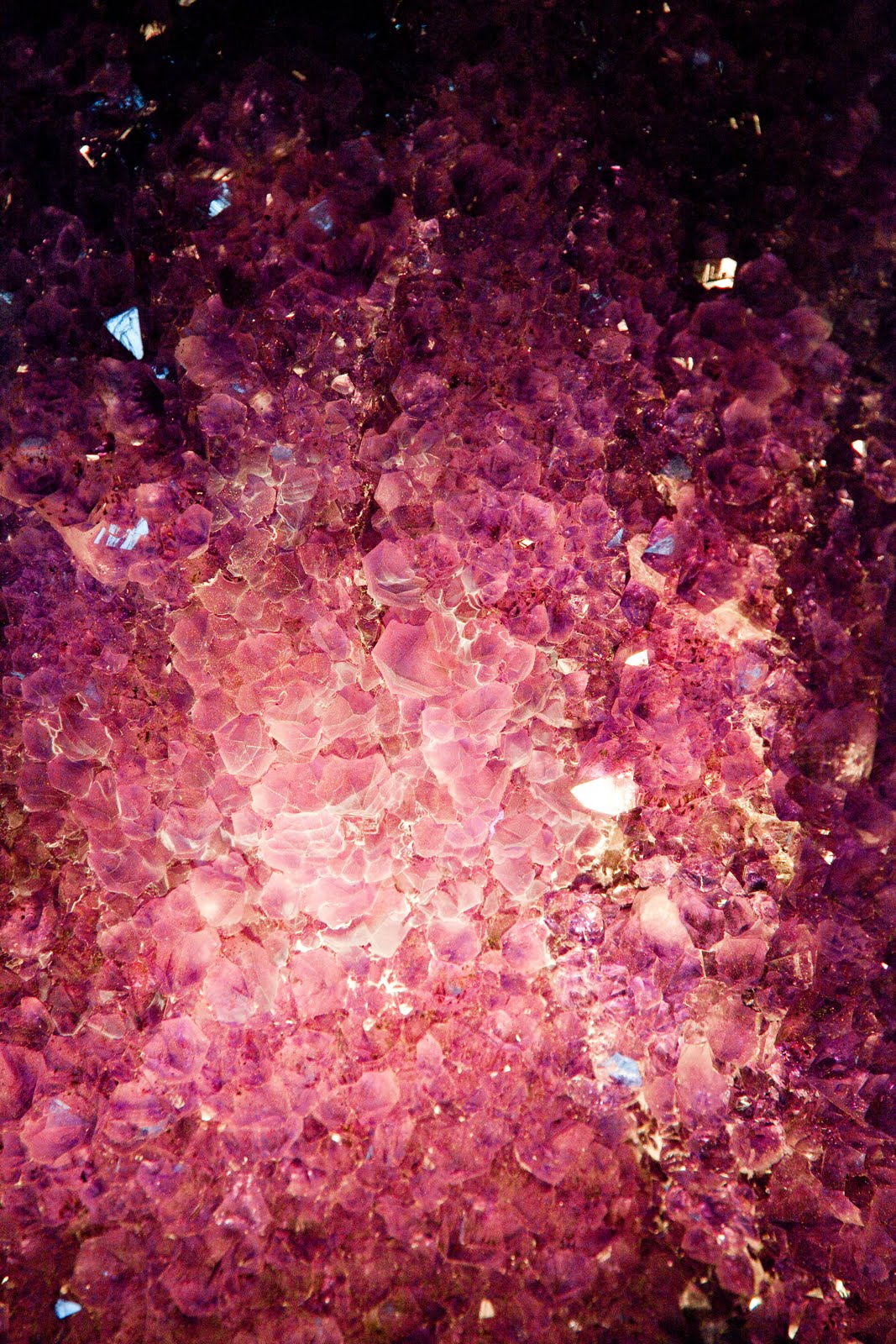
Purple - Suggests religion and royalty
Friends' reactions - confusion, detached/cool, curious
Obviously I totally missed the mark on this image. I was hoping that the gems would inspire a feeling of richness/royalty.

Red and Green (Complimentary Colours - from opposite sides of colour wheel)
Friends' reactions - autumn, hungry, calm
Since we're supposed to feel harmony with these colour combinations, I thought using an example in nature would be the best way to convey that since we see red/green apples so often. It just feels right.

Orange and Red - Similar Colours from the same part of the colour wheel
Friends' reactions - a couple happy's, hungry, and a 'teeth on edge' because of the steel (wouldn't have ever thought that!)
Once again, these kind of colour combinations are considered harmonious therefore should make us feel good. And really, how can you not feel good looking at such bright colours of Jelly Belly's?!
Overall, I think I accomplished what I set out to do - elicit emotion through the use of colour as the central theme of the photograph. It was interesting to hear from others what they thought since with each photograph I was pretty confident that they would feel the same thing I did when taking the shot. Wrong! Once again, it goes to show you how we all bring our own biases to what we see.


